|
|

|
What Color Is Your Garden?
Every garden begins with the color green, of course, but there are a host of other colors present in your garden environment.
Think of the house and its trim paint, the hues of fences, swimming pools and paving—from brick to concrete to bluestone—and the colors of existing trees and plants. To build an inviting and colorful garden, it helps to know about how colors interact.
The old-fashioned color wheel: the three primary colors, red, yellow, and blue, are arranged around the circle with secondary colors, orange, green and violet, between them.
Light and Dark
Colors can be divided into light or dark colors--a quality called value. White plus a hue produces its tint: red plus white makes pink. Add black paint to make a shade, red plus black equals the dark rich reds of some roses.
Color value is important in gardens since light colors show up better in the shade and in the evening, but tend to look washed out in bright sunlight or glare off paving. Dark and rich colors hold their own in bright sunshine, but fade into the background if viewed from far away or in fading daylight.
Hot and Cool
Colors are also commonly divided into hot and cool colors: Hues with a bit of blue in them—everything from green to red violet--are called cool colors while those with a hit of yellow are warm colors--everything from yellow green to orange red.
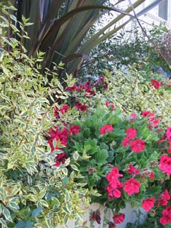
Reds and pinks can be either hot or cool. Think of the pink impatiens with a touch of lavender and those with a touch of apricot. In most cases combining hot and cool reds and pinks isn’t successful.
In your garden, the hot/cool quality of colors allows you to play tricks of perception. Cool, blue-tinged hues appear to recede, while warm ones seem to advance. A small terrace seems larger when surrounded by beds of blue, lavender, violet and mauve flowers. A too-vast lawn can be cozied up by borders of bright yellow, orange and red daylilies.
Hot or cool colors produce different emotional responses, too. Cool colors feel quiet and dignified while hot colors feel lively and gregarious. You can set the mood in your garden by the colors you choose.
Basic Color Harmonies
The color wheel also shows how to put together satisfying color schemes:
- Complementary color schemes use colors across the wheel from each other, such as red and green. These produce the greatest color contrast and make a dazzling display: red roses against ivy; yellow tulips and violet pansies, blue lupine and California poppies.
- Analogous Color Schemes are built of one primary color, a secondary and the intermediate hues between them. Crimson, red violet and violet is one analogous color harmony that’s very popular in its tinted version of pink, mauve and lavender. These schemes create a quieter effect, but always look good together.
- Monochromatic color schemes use a single hue. There are famous one-color gardens in some of England’s historic homes. White and cream make wonderful monochromatic gardens, especially for viewing in the evening since white and yellow stay visible as dusk deepens into night.
Don’t Forget the Green
Take a closer look at the green leaves in your garden and you’ll see a variety of colors: blue-grey iris leaves, ruby-tinged rose leaves, yellow-green new growth on boxwood hedges.
These varying leaf colors can intensify or soften the flower colors they are grouped with. Against grass-green leaves reds will dazzle, yellows deepen and blues shift towards violet. A blue-green or grey-green foliage background softens hot orange and scarlet, but heightens the ghostly pales of pink and lavender.
When you know how colors work and play together in your garden, you can create the looks that please you most.
|
|

